Content Sections
You’ll recall our position, and that of many others, that ‘excess mortality’ is one of the few metrics that gives us a realistic view of the seriousness of the current pandemic. It tells us the amount of additional mortality over the number expected, generally based on the previous 5-year period.
Bottom line – as EuroMOMO statistics on excess mortality continue to show, there is no excess mortality in many of the 27 European countries who share information with EuroMOMO.
EuroMOMO countries in which there is currently no excess mortality include: Cyprus, Estonia, Finland, Ireland, Israel, Luxembourg, Malta, Norway, Northern Ireland, Scotland and Wales.
There is presently low excess mortality in: Denmark, Germany, Greece, Hungary, Italy, Netherlands, Spain and Sweden.
And finally, there is currently high excess mortality in just 22% of EuroMOMO partner countries, namely Austria, Belgium, Switzerland, Portugal, Slovenia and England.
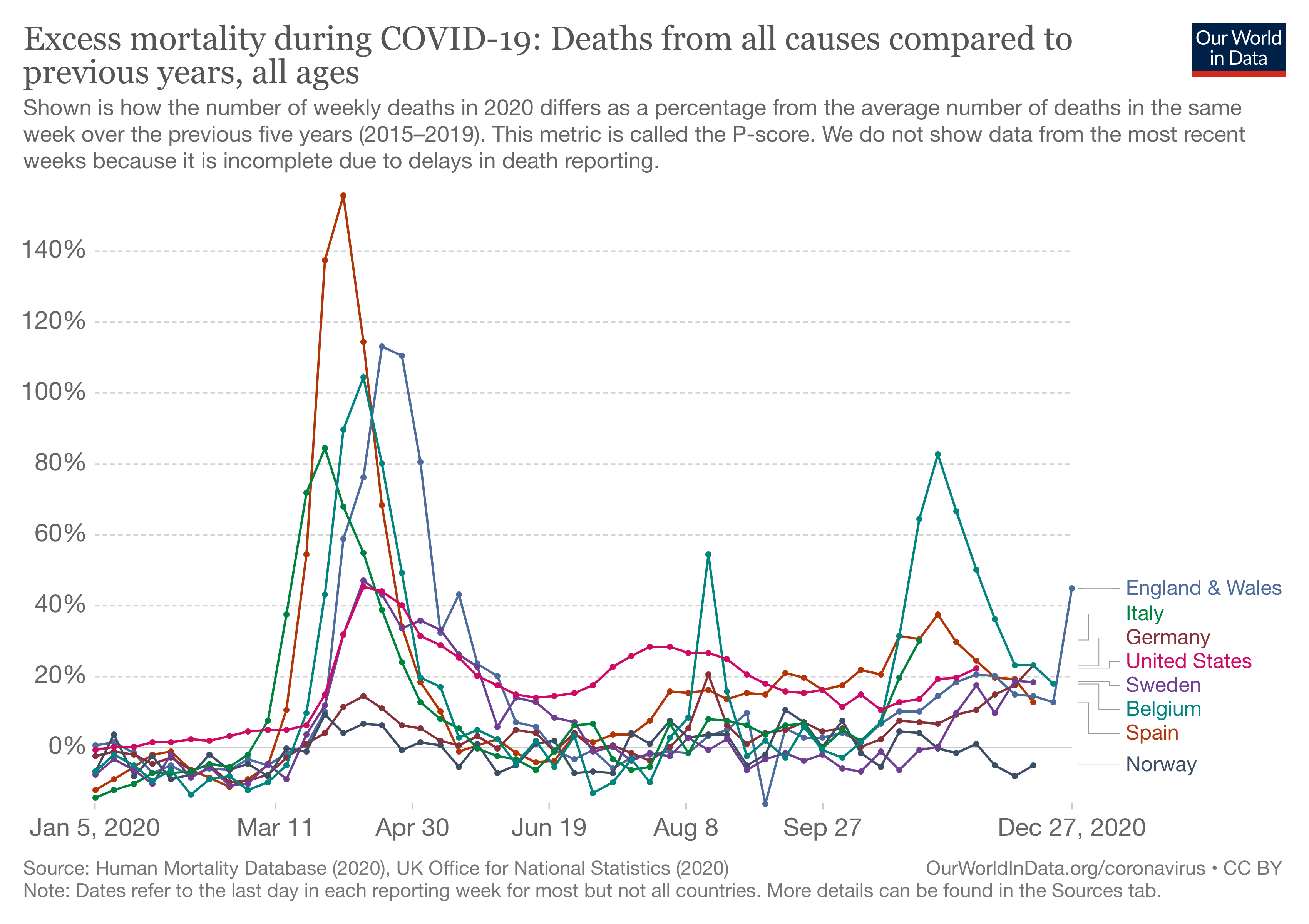
This is a different viewpoint compared with the mass hysteria being projected by the mainstream media. Also the view that the current situation is ‘as bad as’ or ‘worse than’ the first wave is misplaced. You can see this in the chart below that we’ve created by selecting a few key countries from Our World in Data (Fig. 1).

Figure 1. Excess mortality in selected countries since January 2020 to December 2020
England and Wales
Given the big peaks of the USA in the first wave and the England and Wales in the second wave, we’ve looked in more depth at these data.
Firstly, you’ll see that in England and Wales (Fig. 2) there has been a higher total number of deaths than at any time since 1971

Figure 2: Total mortality for England and Wales by year, 1971-2020. Source data: Office for National Statistics
However, the population has grown during this time. So it makes more sense to look at mortality per 100,000 of population. We look at this in Fig. 3. Here you’ll notice something very different to that which is being communicated in the mainstream media. If we look at the same period (1971 – 2020), apart from the dip in mortality per 100,000 population we’ve seen since 2003, the mortality in 2020 was lower than previous years. It also wasn’t as exceptional as many politicians or media commentators would have you believe.

Figure 3: Mortality per 100,000 population for England and Wales by year, 1971-2020. Source data: Office for National Statistics
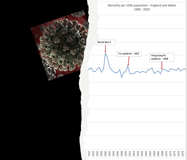
In the next Figure (Fig. 4) we look at the same official data for England and Wales, but we go back further in history and superimpose some of the momentous events like WW2 and pandemics dating back to the Spanish Flu of 1918-19. In that light, the spike of deaths linked to the Covid-19 pandemic of 2020-21 (at least in 2020) looks on par with some of the biggest disasters of the last 120 years.

Figure 4. Total mortality in England and Wales: 1900-2020. Source data: Office for National Statistics
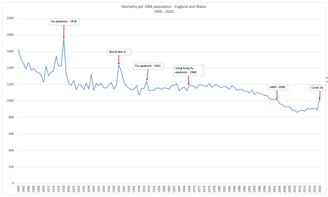
It’s only when we factor out the increase in population over that time and observe the same data per 100,000 head of population that we can get a more realistic perspective on our current predicament (Fig 5). As you’ll see, the purported ‘epic’ proportions of our current circumstances don’t look anything like so bad.
The worst part of it, as we continue on our current journey, it will not be possible to apportion deaths only to the virus. Mortality linked to increasing incidences of depression, lack of opportunity, suicide, domestic violence, unemployment, social isolation, and all the other factors linked to the policies that have been implemented by our governments, will come into play.

Figure 5. Total mortality per 100,000 population in England and Wales: 1900-2020. Source data: Office for National Statistics
On the other side of the pond
If we now look at the USA in the same way, the picture is somewhat different. In terms of total mortality, you see a similar picture with 2020 having the highest recorded mortality since 1979 (Fig 6).

Figure 6: Total mortality for USA by year, 1979-2020. Source data: Centers for Disease Control
The big difference comes when we look at the mortality per 100,000 population (Fig. 7). Here, there is no getting away from the fact that 2020 in the USA is a very bad year for death – the worst since 1979. More to the point, it’s a trend of increasing mortality.

Figure 7: Mortality by 100,000 population for USA by year, 1979-2020. Source data: Centers for Disease Control
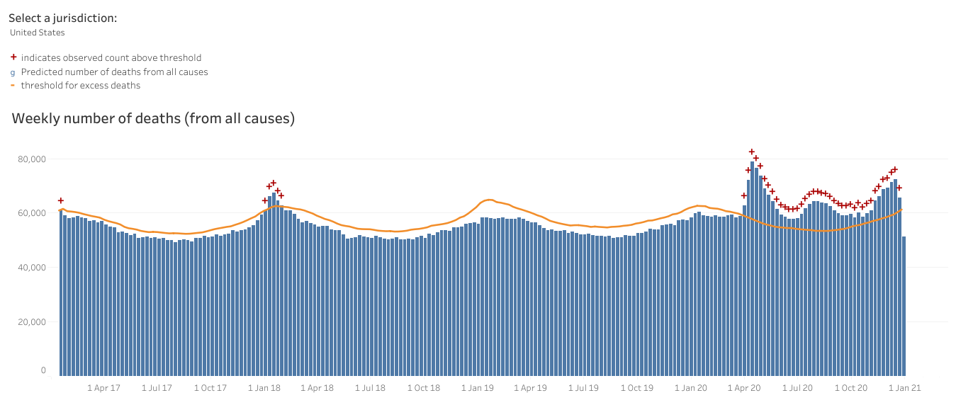
When you look at excess mortality (Fig. 8), we are again remind of the unfortunate picture faced by the US – it has faced excess mortality since the first wave hit in New York, then in the southern states, and subsequently worked its way across the country, the impact heightening as we move into winter and see covid-related deaths conflated with flu and pneumonia.

Figure 8: US excess deaths by week 2015-2020 Source: Centers for Disease Control
Where's the smoking gun?
What might be the drivers of this unfortunate situation? We're all tossed to looking for a culprit, the smoking gun, and don't spend enough time looking at ourselves. It's easier to blame the bullet from someone else's gun the it is the vulnerability of our own flesh.
Clearly mortality is multi-factorial, so the additional deaths cannot be apportioned only to the effect of one virus. It would be reasonable to theorise that the increasing levels of overweight and metabolic disease among the US population — and other 'victims' of the standard American diet coupled with sedentary lifestyles — are underlying drivers. So when a virus came along that was able to exploit unhealthy people – it had a field day, or should we say, a field year (at least).
On top of that, you have the additional sickness and accelerated death of those whose needs are no longer adequately served by the restricted existence and lost opportunities forced upon us by government policies. As the recently released UK Recovery report shows, the indirect effects of lockdowns, social isolation and related measures are dire. Their effects, such as the inequalities they create in education, could last a lifetime.
With the perennial focus on disease as opposed to health and resilience, society fails to see what many Americans and Europeans are capable of doing through self-care and enhancing their in-built capacity for resilience. Educating people who have yet to discover the wonders of natural health should be the focus of us all in these difficult times. It's becoming increasingly that governments will never participate in this process such is their linkage with corporations that are so ready to exploit the populace at large.
As the virus becomes more ubiquitous, it will be ever easier to apportion deaths to SARS-CoV-2. The focus on case rates will allow the pandemic to exist to eternity as low prevalence increases the rate of false positives in PCR and other molecular tests.
We need to get some perspective on what’s really going on.
We hope this article and these graphs – all created by us at ANH-Intl using official data do just that: give you much needed perspective that the mainstream media and politicians are not currently affording the public.
Please share widely.


Comments
your voice counts
15 January 2021 at 9:28 am
The interpretation is of course statistically interesting, but stratifications such as age, sex, and expected and average lifespan should also be included as should the recent data from the Economic Statistics Centre of Excellence in which they suggest that population levels in the UK may have declined by as much as 1.3 million https://www.escoe.ac.uk/estimating-the-uk-population-during-the-pandemic/ a variable that should also be reflected in the analysis?
15 January 2021 at 10:38 am
Thanks for this, Mike - and the Escoe report does indeed make for interesting reading especially in relation to the effects of the pandemic and Brexit on migrants and return migration. Our analysis was intended to simply be a topline, macro view - and hence was unstratified. The 2020 population figure we used in our mortality per 100,000 metric relied on data from the ONS that included the relevant adjustment. If the population shrunk because of return migration it would actually exaggerate, not dilute, mortality per 100,000. But it will be the long-term trends that count and we'll definitely be doing further analyses including more segmentation. Thanks again for bringing the Escoe report to our attention.
18 January 2021 at 5:46 pm
"ESTIMATING" the UK population.... in today's age of tech and record keeping we only estimate population then how can we trust any stats regarding population and disease effects?
15 January 2021 at 11:30 am
The statistical comparisons for the UK perhaps shine a light on the positive habits maintained by our population, in comparison to the US. The point about a lower proportion of our population dying than in previous years is valid, though it is a tragedy that so many people have died this year (arguably unnecessarily), in part due to poor public health education over several years, but also more recently, a reduction in public services that help to maintain mental and physical health.
15 January 2021 at 1:48 pm
I notice that the excess deaths figures by country does not compare all countries up to the end of the year. Some seem to only have data up to early December (scale is very poor) so the post-Christmas peak is not shown for many countries. It is important to have comparable figures even if that necessitates a slight time lag.
I accept that that the rate of deaths is not quite as bad as often reported but there is no mention of long Covid. This is quite significant for the population's overall health.
Finally, there is no assessment of the impact on hospitals. I would suggest that nearly everyone who dies from Covid ties up a hospital bed for a week or two beforehand. A lot of other non-Covid deaths don’t.
15 January 2021 at 2:57 pm
Surely the most striking element of the latest mortality stats is that the normal winter flu has all but disappeared entirely as a cause of death. This is unprecedented and inexplicable by any other presumed cause than the now routine designation of deaths in the older population strata as "Covid deaths".
Of great concern is the 're-definition' of "herd immunity" quietly slipped into the relevant documents by the WHO. 'Herd immunity' is now defined as being "a concept used for vaccination in which a population can be protected from a certain virus if a threshold of vaccination is reached. Herd immunity is achieved by protecting people from a virus, not by exposing them to it."
I suggest that the WHO's name ought to be altered to WAVP: the World Agency for Vaccine Promotion. It might also be appropriate to include within its name the reality that it is far less concerned with promoting health than with pursuing the population reduction/eugenics programme.
17 January 2021 at 8:16 am
I have also been very skeptical over the recent reports of drastic increases in the number of Covid-19 deaths, even though the overall mortality statistics have not increased signicantly. My comment pertains to the question, what is the greater risk - the virus or the vaccine.
I stumbled upon a recent report in the Berliner Zeitung 16 Jan 2021 of 23 recent deaths in the 80+ age group in Norway following vaccination with the Pfizer/BioNTech vaccine (13 confirmed by the Norwegian health authority Folkehelseinstituttet). The Norwegian authorities subsequently changed their recommendations to exclude "fragile" people in this age group as they are at a high risk of dying from the side effects. The article also refers to a similar incident in Germany where 10 people died shortly after being vaccinated. The Paul-Ehrlich-Institut took the position that these deaths should not be attributed to the vaccine because they were "seriously ill". How can it be that people with pre-existing conditions that subsequently become infected with Covid-19 are included in the death statistics, but when people die from the vaccine, the blame is put on their "pre-existing conditions"?
I also stumbled upon the Chinese news agency CRI, alledging a major media coverup of these incidents while also citing that vaccines developed in other countries have been deemed as "unreliable". Their recommendation is to continue quarantine and control procedures, while acknowledging the importance of also considering the side effects and risks associated with vaccines.
Still other sources blow the incidents entirely off as fake news.
Bavarian Minister President Markus Söder has launched a major campaign to force employees in the care facilities to be vaccinated as a condition of their continued employment. This is after months of promises by the political establishment that vaccination shall remain voluntary. The campaign was the result of a study stating that half of the employees in care facilities, and even doctors working in hospital are refusing the vaccination. These are people with a medical education!
While the alledged increase in Covid-19 deaths is being used to justify an expansion of vaccination efforts, there has been a serious lack of transparency in regards to the risks associated with vaccination. As with any other medical procedure, a patient has to be able to weigh the risks and benefits, which has become practically impossible the way the situation has developed.
https://www.berliner-zeitung.de/politik-gesellschaft/warnung-aus-norwegen-moegliche-nebenwirkungen-des-impfstoffs-li.133073
http://german.cri.cn/aktuell/alle/3250/20210116/607177.html
18 January 2021 at 5:49 pm
And here in the UK medical professions are asking for protection from legal action if death or severe harms occurs after some receives a vaccination. That in itself speaks volumes about this rush vaccine program.
Your voice counts
We welcome your comments and are very interested in your point of view, but we ask that you keep them relevant to the article, that they be civil and without commercial links. All comments are moderated prior to being published. We reserve the right to edit or not publish comments that we consider abusive or offensive.
There is extra content here from a third party provider. You will be unable to see this content unless you agree to allow Content Cookies. Cookie Preferences