Content Sections
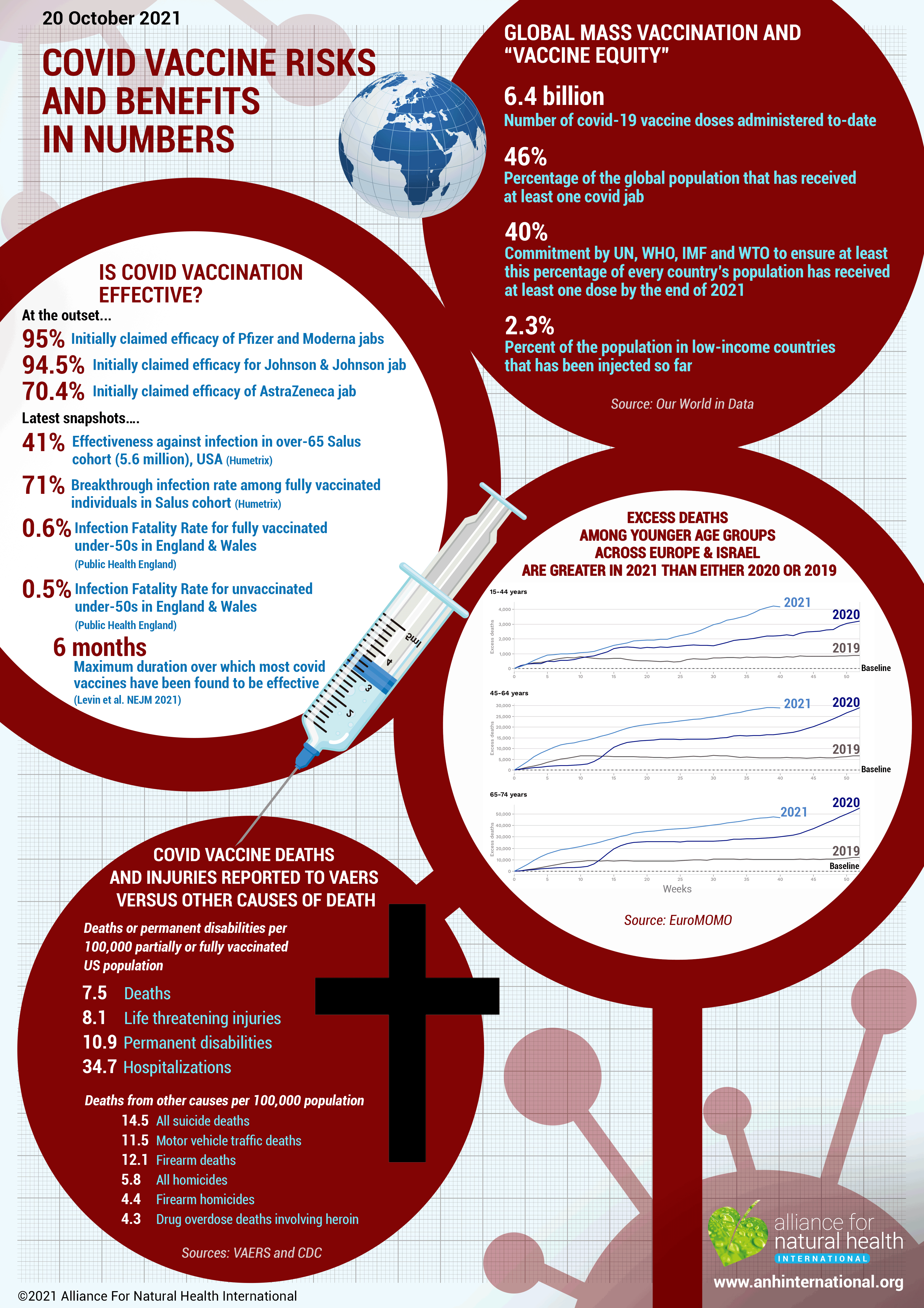
Over the past two weeks, we’ve released two very in-depth, data-laden articles about the current crop of covid jabs: the first dealing with purported benefits; the second dealing with harms. We’re aware that they’re both hefty reads that come with a significant time tag. So this week we offer you a short, visual, summary with some key numbers. We hope this speaks volumes in a shorter timeframe and that you can share this article and the infographic as widely as you can.
Here’s a reminder of the links to the full-length feature articles:
>>> Part One: Latest snapshots of a moving target of a ‘pandemic’
>>> Part Two: How safe are covid ‘vaccines’?
A pandemic of propaganda or a “pandemic of the unvaccinated”?
We are navigating a deeply uncertain world at the moment, made all the more challenging by a lack of coherence between the mainstream narrative and the scientific data that is currently available. Political (and other) agendas abound to further muddy the waters. The following infographic is a visual snapshot of a few of the latest numbers.
Forgive the baldness of the delivery. Numbers shouldn't lie, but they can easily be twisted and turned to say something differently. Fauci, Biden and others may be trying to persuade people that this is a “… pandemic of the unvaccinated” in order to coerce more into accepting the jab, but we leave you to look at the figures below and come to your own conclusion.
You can also listen to an excellent round table exchange between 8 eminent doctors and scientists who share their clinical experience and explain why they have dissenting views compared with those of the 'mainstream narrative'.
(Click on the image below to download the PDF - please share widely!)
>>> Are you a critical thinker? Someone who likes to forge your own path in life, making your decisions based on your own research and independent thought? Do you believe in freedom of choice, liberty and sovereignty of the individual? Are you passionate about health and nature? Have you had #Enough? Yes? You sound like just an ANH Pathfinder. Have you joined our growing community yet?
>>> Visit www.covidzone.org for our extensive repository of over 180 articles since 12th March 2020
>>> Return to the homepage
#enough #enoughmovement


Comments
your voice counts
21 October 2021 at 10:58 am
Hi ANH Team,
You do such incredible work and have helped keep me sane and "properly" informed throughout this insane period - Thank-you. I don't want to sound picky - because your focus on the "real science" is impeccable and exemplary - but just thought I'd bring to your attention the minor typo on the infographic of the "Excess Deaths in younger age groups" - I presume that is meant to headline "... are greater in 2021 than either 2020 or 2019" (Not 2021). :-)
You are all amazing!
21 October 2021 at 1:04 pm
Hi Jennifer, thanks so much for letting us know about the typo on the infographic. This has now been amended and the new version uploaded to the website.
Thanks for your lovely comments, which are always very much appreciated.
Warm wishes
Melissa
26 November 2021 at 11:56 am
Hi, thank you very much for simplifying the data to make it more accessible to those of us without the time for voluminous reading.
The 'excellent round table exchange' has been removed from YouTube for violating community guidelines it seems. Is there anywhere else that it can be/is posted so it remains viewable?
Thanks again,
Ellie
Your voice counts
We welcome your comments and are very interested in your point of view, but we ask that you keep them relevant to the article, that they be civil and without commercial links. All comments are moderated prior to being published. We reserve the right to edit or not publish comments that we consider abusive or offensive.
There is extra content here from a third party provider. You will be unable to see this content unless you agree to allow Content Cookies. Cookie Preferences